The Apple Magic Mouse 2: A Triumph of Design, a Misstep in Usability?
Introduction
In the world of tech design, Apple has long been heralded as the gold standard. Their products often boast sleek, minimalist aesthetics that have set industry trends. However, even the greats sometimes stumble. Enter the Apple Magic Mouse 2—a product that epitomizes the dichotomy of Apple's design philosophy: visually stunning yet questionably practical.

The Designer Behind the Magic
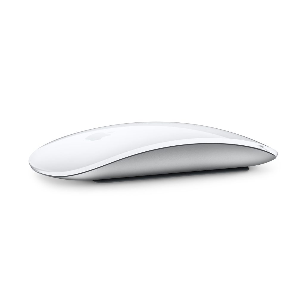
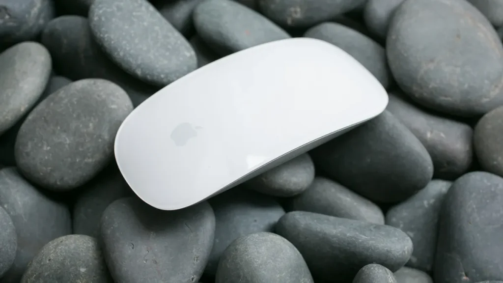
Jony Ive, Apple's former Chief Design Officer, is the creative genius behind many of Apple's iconic products. Known for his meticulous attention to detail and unwavering commitment to simplicity, Ive has often prioritized form over function. The Magic Mouse 2 is no exception. This wireless mouse, with its seamless aluminum body and touch-sensitive surface, looks more like a piece of modern art than a computer peripheral.

A History of Innovation and Controversy
The Magic Mouse 2 was introduced in October 2015 as an upgrade to its predecessor, the original Magic Mouse. While the first iteration was lauded for its innovative multi-touch capabilities, it was not without its critics. The second version sought to address some of these issues but introduced new ones in the process.

Pros and Cons of the Magic Mouse 2
Pros
- Aesthetic Appeal:The Magic Mouse 2 is undeniably beautiful. Its low profile and minimalist design make it a perfect companion for any Apple product.
- Multi-Touch Surface:The touch-sensitive surface allows for intuitive gestures, such as swiping between pages and scrolling, which can enhance productivity.
- Rechargeable Battery:Unlike its predecessor, the Magic Mouse 2 features a built-in rechargeable battery, eliminating the need for disposable batteries.
Cons
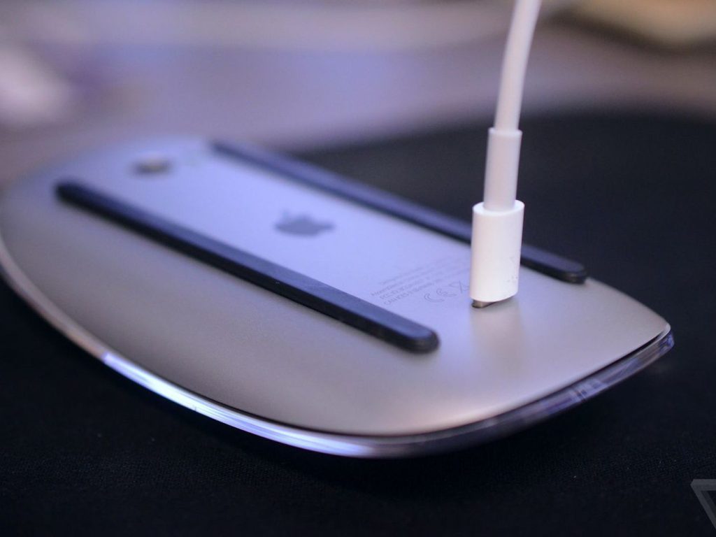
- Charging Port Location:In perhaps the most baffling design decision, the charging port is located on the bottom of the mouse. This means the device cannot be used while charging, rendering it completely useless during this time. A truly un-Apple-like oversight.
- Ergonomics:The sleek, flat design, while visually appealing, can be uncomfortable for prolonged use. It lacks the ergonomic support found in more traditional mouse designs.
- PricingAt a. premium price point, the Magic Mouse 2 is significantly more expensive than many of its competitors, making its practical shortcomings even more glaring.
- Rechargeable Battery:Unlike its predecessor, the Magic Mouse 2 features a built-in rechargeable battery, eliminating the need for disposable batteries.
- Low Latency:The Magic Mouse 2's low latency makes it excellent for scrolling through web pages and long documents. The multi-touch surface allows for smooth gestures, providing a seamless user experience. Cons
Design Philosophy vs. Pragmatism
The Magic Mouse 2 serves as an excellent case study in design philosophy. It perfectly embodies Apple's relentless pursuit of aesthetic perfection, sometimes at the expense of practicality. This is a product that looks beautiful on a desk and feels natural within the Apple ecosystem, but it may frustrate users who prioritize functionality. The Magic Mouse 2 illustrates the tension between design and usability, showcasing how a focus on visual appeal can sometimes overshadow practical considerations.

Conclusion
The Apple Magic Mouse 2 is a testament to the brilliance and occasional folly of Apple's design ethos. It's a product that will undoubtedly appeal to those who value design above all else, but it may leave power users and practical-minded individuals scratching their heads. In the end, the Magic Mouse 2 is a beautiful reminder that even the most innovative companies can sometimes prioritize style over substance.
In the immortal words of Jony Ive, "A great product isn't defined by the number of features, but by the quality of the experience." For the Magic Mouse 2, that experience is as polarizing as it is beautiful.
